A Definitive Ranking of the 2026 World Cup Kits
- Jun 11
- 17 min read
Updated: Jun 18

Call us The Lonely Island feat. Michael Bolton because the boys are back. The welcome return of the planet’s biggest and best sporting event means it is time for the third edition of our World Cup jersey rankings! ICYMI, you can view our 2022 piece here and 2023 list here.
But this one is particularly noteworthy because FIFA has expanded this year’s tournament to 48 teams, meaning that this is our largest rankings column yet! You may want to pull up a chair and peruse this write-up when you have some time to spare. It’s a doozy.
As you will see, just like in our inaugural men’s World Cup write-up, we have ranked each country’s jerseys by overall package (that is, taking both or all three shirts into account and rating them with a combined score). But because this system penalizes teams that have one excellent kit and one mediocre-to-bad kit, we have also listed our Top 10 individual shirts that we each love, regardless of where that country ranked in our team standings.
We did not agree on every single one of these (with over 100 jerseys to rate, is that a surprise?). But we had fun analyzing and debating the merits of each, and we hope you enjoy reading this list even if you think our opinions/rankings are garbage. No hard feelings – we’re just happy you’re here.
Now without further ado, in order of best to worst, we humbly present for your consideration… the 2026 World Cup jersey rankings!!
1. Mexico 🇲🇽


Gabriel: I am surprised that we have the same country topping this poll that we did in 2022! But I am not surprised that that country is Mexico. ‘El Tri’ rarely miss with their kits, and this year’s package continues that trend. Their national color template lends itself to some exciting possibilities, and Adidas delivered in spades. The Aztec-themed patterns, three different collar designs with nicely accented shoulder stripes, and one of the best federation logos in world football all combine to produce some gorgeous shirts. Bonus points for the Mexican flag-inspired ‘Trefoil’ symbol on the third kit. This team may not make it past the Round of 16, but at least they’ll look awfully sharp while crashing out
Ben: El Tri retained the crown for another World Cup... kit ranking. When we make these rankings, we’re looking at the whole package. These trio of jerseys check all the boxes. Local pattern, national color and cultural nods are not hard to spot, but not overdone or overwhelming. From the clever detail of the tri-color Adidas logo on the black kit, the pattern on the black and white kits which are “inspired by sacred geometry and ancient temples” and the green home kit which is undeniably... Mexican! El Tri have got themselves a beautiful trio.
2. South Africa 🇿🇦


Gabriel: How cool is it that the first game of this year’s World Cup features our top two jersey hauls facing off?? All of what I said about Mexico’s shirts applies here, as well (except swapping the Aztec nods for patterns that pay homage to South Africa’s 12 official languages), and I like that the green away kit almost feels like a rugby jersey given the popularity of that sport in South Africa. These are two classy and well-executed looks for Bafana Bafana to rock this summer. You can practically hear the famous Peter Drury call now…
3. Ghana 🇬🇭


Ben: I need to talk to Puma’s design team for a second. Everyone else can move on to the next one. Puma Puma Puma... You took some swings this year. Some BIG swings. And let me tell you. You had some home runs. Take Ghana for example. I give big props to a pair of jerseys when they celebrate a country. And these two are a party! The home is an ode to Kwaku Ananse (a trickster spider-man from Ghanaian folklore) in the style of Kente cloth patterns. The bright yellow away with its green and red trim is a pattern taken straight from Accra's Makola Market. It is cool to know that when these African players take the field, they’ll be truly wearing a part of their country on their back.
4. Germany 🇩🇪
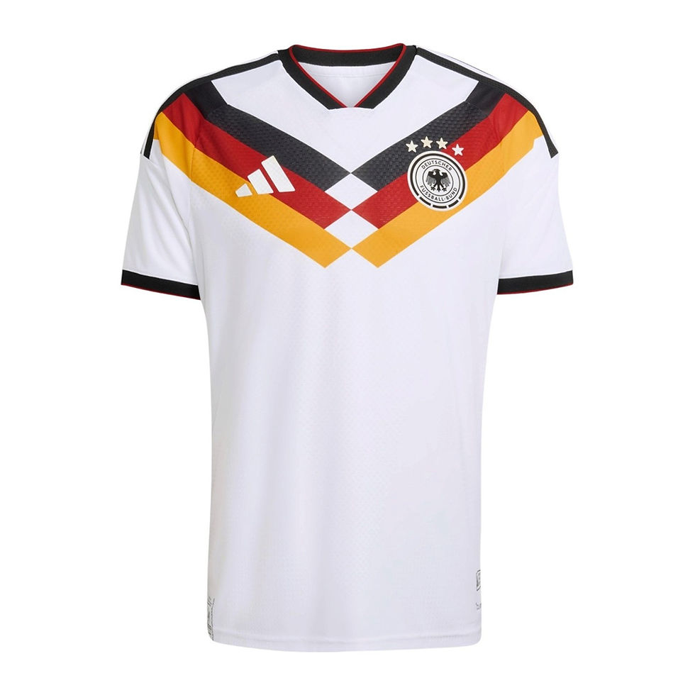


Ben: Having the best kit of the tournament is a big honor. And in my humble opinion, Germany nailed it with their home uni. The classic white with a trio of lines coming from the shoulders is simple but not understated. The away kit lets them down just a bit, hence the #4 overall ranking. The blue tone is nice, but the pattern is... interesting. A bit random. The mysterious black pinstriped third kit is what saves Germany in the end.
5. New Zealand 🇳🇿


Ben: Puma again understood the assignment. Take what a country is known for and execute accordingly. The all black home kit with its fern pattern oozes class and is the perfect example of a well executed pattern. The white away is inspired by hau – the breath of life. It’s the four winds that bring the country together. Lets hope those same winds will push them past the group stage!
6. Curaçao 🇨🇼


Ben: Oh Curaçao... a small island nation with two jerseys that exude topical vibes. The bright blue home with its nautical sleeves and the yellow away with its colorful sleeve stripes are both great examples of how doing less is sometimes the better option.
7. Australia 🇦🇺


Gabriel: Speaking of great federation badges… Australia’s home jerseys are usually pretty simple because their yellow and green color scheme does all the heavy lifting by itself. I like the subtle white trim and the trapezoidal collars on this year’s home shirt, but the away kit is the standout. It features two color shades that shouldn’t really work when juxtaposed on a jersey, but they most certainly do, conjuring up images of sunset over the Outback and the Great Coral Reef. No “aur naurr”s here!
8. Canada 🇨🇦
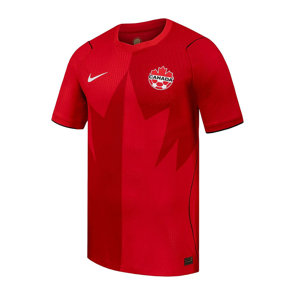

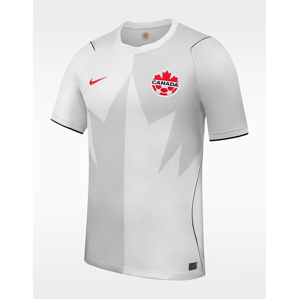
Ben: If you told me that these smelled like maple syrup, I would believe you. Our neighbors to the north delivered a trio of kits that are fun, creative and uniquely Canadian. The maple leaf motifs throughout and the clean lines of the home and the third kits speak to a design team who got the message. Treat yourself to some poutine while rocking one of these to get the true experience.
9. Iraq 🇮🇶


Gabriel: A very solid package from the Lions of Mesopotamia. Iraq’s federation badge isn’t the most creative, and I’m not always a fan of combining multiple patterns on a shirt. But they just about pull it off thanks to some cool designs, sharp shoulder, collar, and sleeve trims, and a unique manufacturer brand. It’s good to see the Arab Cup’s most successful team back on the biggest stage after a 40-year absence, and they are well-dressed for the occasion.
10. Czechia 🇨🇿


Ben: The details won me over with Czechia’s two kits. The trim pattern on the home’s color and sleeves and the luxurious pattern white away are the difference makers.
11. Norway 🇳🇴


Ben: Has any team had a better PR campaign than the Norwegian national team? I think three different people sent me their viking photoshoot. Then you also release one of my favorite kits of the tournament? The red and blue cross with it is further improved by a subtle Norse pattern. The black and white away and third are only something that a Scandinavian country can do. Don’t ask me why. It just works for them.
12. Spain 🇪🇸

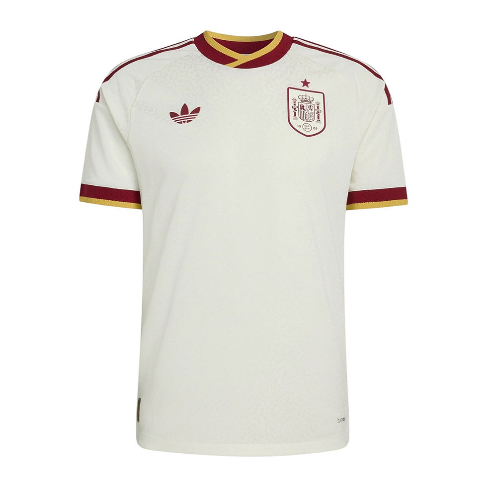
Gabriel: Futbol traditionalists may take issue with how much blue is featured on La Roja’s home shirt this year. After all, solid red kits are kind of Spain’s signature. But I actually don’t mind it! The pinstripes and alternating-color shoulder stripes add some extra flavor, and I appreciate the good balance + sizing of the federation and manufacturer logos. As for the away kit? Pure class. I don’t even need to analyze. Just look at it.
13. Japan 🇯🇵


Gabriel: I’ll make an exception for my ‘don’t put the manufacturer logo above the federation logo!!’ rule here, because at least the lines across the chest of the Samurai Blue shirts draw your eye to the team emblem. I also like the subtle red accent on the collar. The away jerseys don’t feel specific to Japan, but they’re very creative and it’s hard to go wrong with black trim on a white shirt, so what the heck, sure.
14. France 🇫🇷


Gabriel: Another home jersey that Ben and I disagree on, oops. I’m a huge fan of Les Bleus’ home strip this year. The button collar feels typically chic and French, but the black highlight zig-zag pattern does NOT feel typically French, and I applaud Nike for the creativity. I can already see the embarrassingly talented front line of Dembelé, Doué, and Mbappé leaving opponents cross-eyed in these uniforms. I want to like the away shirts, too. I really do. The blue and red trim, the gold federation logo, the sun symbol inside the collar… the ingredients are there. But the color is straight-up toothpaste. And France doesn’t have enough of a beach-culture society to warrant this bright, sugary submission (begging your pardon, Nice and Saint-Tropez).
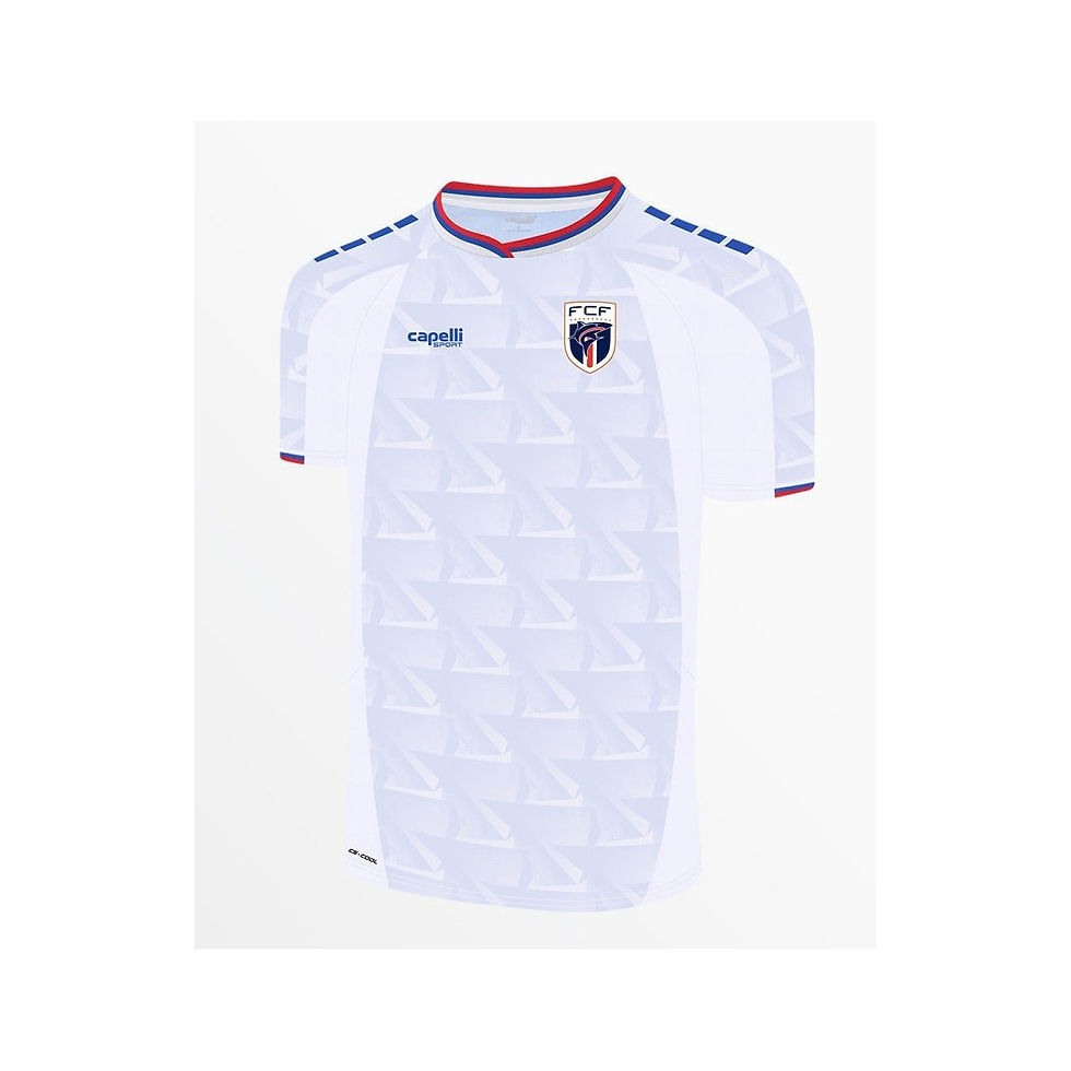
15. United States 🇺🇸
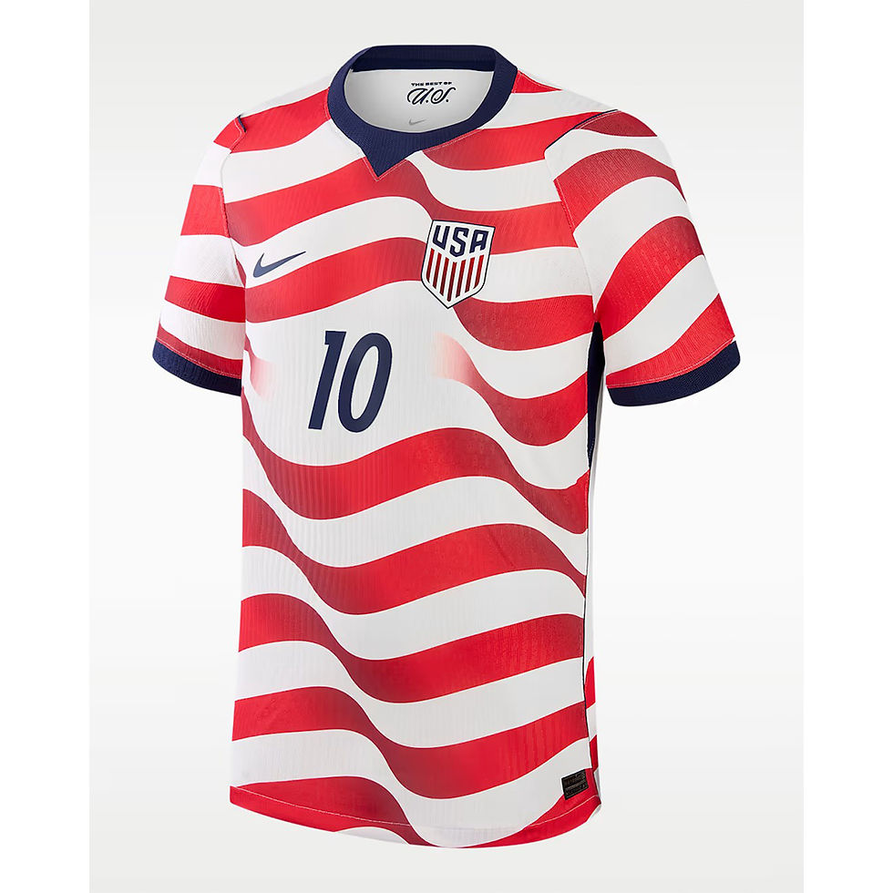

Gabriel: The USMNT’s kits for the 2022 World Cup were universally hated. “Get these trash jerseys out of the way for this tournament and come back in style for hosting in 2026.” is what I said in our rankings piece for that year. And I’m pleased to say that we (mostly) did come back in style!! Bringing back the fan favorite ‘Where’s Waldo’ design for the home shirts but with a flag-specific twist was a smart move by Nike, and the blue on the sleeves along with a solid tagline pun inside the collar makes this a great effort all around. As my esteemed colleague correctly points out, the back of this shirt is a little more disappointing as the red and white stripes give way to a large blank space for the name and number. But even that isn’t enough to dock this shirt serious points. The subtle star pattern on the midnight blue away kit saves it from being a boring, uninspired effort, and I like the choice to use the white federation logo to help it stand out against the dark base color. May our boys taste unprecedented success in these shirts.
16. Morocco


Ben: Similar to the Czechia pairing, the details won me over. Gabe noted that the home felt “a bit too Christmas-y” but I think it’s a well executed kit. I love the white with its detailed traditional pattern down the whole front. They might’ve “won” AFCON via sus circumstances, but these two kits are a clear W... in my book at least.
17. South Korea 🇰🇷


Ben: I mentioned it earlier with Ghana’s kits, but it’s really cool when you could take off the national badge and know exactly what country the jersey is meant for. This is true with South Korea’s pairing. I love the mountain... maybe tiger pattern on the bright red home and the floral away kit is just perfect for a smiling Son Heung-min.
18. Tunisia 🇹🇳


Gabriel: The jersey combos ranked in this section of this list are often here because my fellow author and I feel differently about them, so they end up in the middle by default. Tunisia’s kits are a great example of this disagreement. I’m a big fan of these shirts. Interesting patterns and cool logos are usually enough to salvage the plainer color templates, and that is the case here. Slight minus points for the patterns not extending past the sleeves, but still very solid overall from the Eagles of Carthage.
19. Sweden 🇸🇪


Ben: The next few countries are examples of teams with one star player holding up the rest. For Sweden, it’s their blue away kit. The traditional pattern is fun, creative and wonderfully executed. The home kit is... what they always have. End of the story.
20. Egypt 🇪🇬

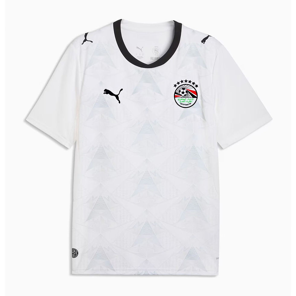
Gabriel: From Tunisia to their fellow North African neighbors! Egypt returns to the global stage with some sharp, geometric kits. I love the gold and black touches on the home shirt and take note of the subtle Ankh just underneath the collar. A similar triangular pattern adds some flavor to an otherwise plain away top. Long live the Egyptian King. We miss you already, Mo.
21. Panama 🇵🇦


Ben: Panama went full retro with their trio of Reebok kits. The blue home is definitely the star player in this mix though. The home and away are a bit plain.
22. Senegal 🇸🇳


Gabriel: For the record, I wanted these to be ranked higher! Should the kaleidoscope pattern on the away shirt take up more of the jersey? Yeah, probably. Should the green away shirt actually be the home shirt? Yeah, probably. I’m not saying these are perfect kits. But you won’t see many more authentic and creative outfits at this tournament. Between their nickname (‘Lions of Teranga’), their excellent color scheme and vibrant jerseys, and their famously passionate fans, how can you not root for Senegal?
23. Colombia 🇨🇴


Gabriel: This home shirt is a thing of beauty. More on that later. I want to love the away jersey because it’s super funky. But I’m not feeling the neon green-yellow trim.
24. Belgium 🇧🇪


Gabriel: Just as they did in 2022, Belgium lean into their ‘Red Devils’ moniker to good effect with their home jersey. The gold and black touches elevate this shirt, just as they did Egypt’s first kit. As for the away top? Kudos for a cool tribute to the surrealist painter, Rene Magritte. It features a cheeky Easter egg tucked inside its collar, which reads “This is not a jersey”, alluding to one of his most famous works. But experimentation and cultural tributes on jerseys still must clear the bar of actually looking good. And sadly, this cotton candy canvas does not.
25. Argentina 🇦🇷


Ben: The reigning champs bring two kits that are... a bit mid. They could be much better with a few adjustments. Let’s start with the home. Don’t do the gradients on the stripes, don’t bring the center stripe all the way to the collar and make the badges a bit smaller. The away would be perfect if they made the design a bit subtler.
26. Austria 🇦🇹


Ben: The away kit saves Austria. The marble with gold inlay, a nod to the cafe scene in Vienna, is a classy take that was worth purchasing. The home is a bit basic in comparison. Puma definitely could’ve done more.
27. Bosnia and Herzegovina 🇧🇦


Ben: When home and away kit are just color swaps of each other, it usually makes for a bit or a boring combo. B&H’s pairing are just that. Fine in concept but just a bit... boring.
28. Scotland 🏴


Ben: With Scotland’s return to the World Cup for the first time this CENTURY, you’d expect a duo of kits that would celebrate that. The navy blue with subtle pattern is great but the pink away? Really? I know it’s a color that’s used traditionally around the country but using it for the main color was a bit much.
29. Portugal 🇵🇹


Gabriel: Portugal’s home shirts are nothing too crazy, but this color scheme will always be a winning combo, and I like its compass rose inset and pointed V-neck collar. The away jersey is doing too much. I will give them credit for being brave enough to set the national crest above the manufacturer logo (finally!), but that’s the only positive thing I have to say about these shirts. Watching the Crying Ronaldos get sent packing in these abominations will add a few years to my lifespan.
30. DR Congo 🇨🇩


Gabriel: DR Congo is back at the World Cup for just the second time and the first in over 50 years, and one thing you cannot say about their kits is that they lack creativity! But that is as far as the compliments extend, and their sheer (mostly) originality are the reason this package doesn’t rank lower on our list. The away shirt might as well be a China jersey, and the unfinished tiger print and diamond patterns on the home and third kits are… something. This team and its fans deserved more.
31. Brazil 🇧🇷


Gabriel: These home jerseys may not go down as all-time classics in the pantheon of famous Brazilian kits, but there’s only so much damage you can do to the iconic yellow and green. I would like this jersey more without the unnecessary aqua stripe down the sides and the green shoulder lines, but it’s still perfectly fine. The away kit is not. What are we doing here? I hate the splotchy pattern and the Air Jordan logo feels so out of place. The aqua is even more of an eyesore here. Nike was given the keys to the most recognizable and beloved jersey templates in World Cup history, and these were the best they could produce? For shame.
32. Switzerland 🇨🇭


Ben: Right around here is where I start writing shorter, some might say punchier reviews. Think of it as those comments you got on your bad papers in high school English.
The Swiss were so close with these two. The red home needed more contrast with the typography pattern and the neon green (why tho?) needed to be a deep forest green.That is all. NEXT.
33. Algeria 🇩🇿


Ben: The home looks like coffee stain-tire tracks and the away is a bit too Christmas-y.
34. Saudi Arabia 🇸🇦


Gabriel: I really like the pattern on the home jersey, and I don’t even mind the purple trim on its collar. But the purple shapes all over the rest of the shirt were an unnecessary addition. I normally have no interest in plain white jerseys, but a cool federation logo and the sharp collar + shoulder stripes give this away kit a classy feel.
35. Jordan 🇯🇴
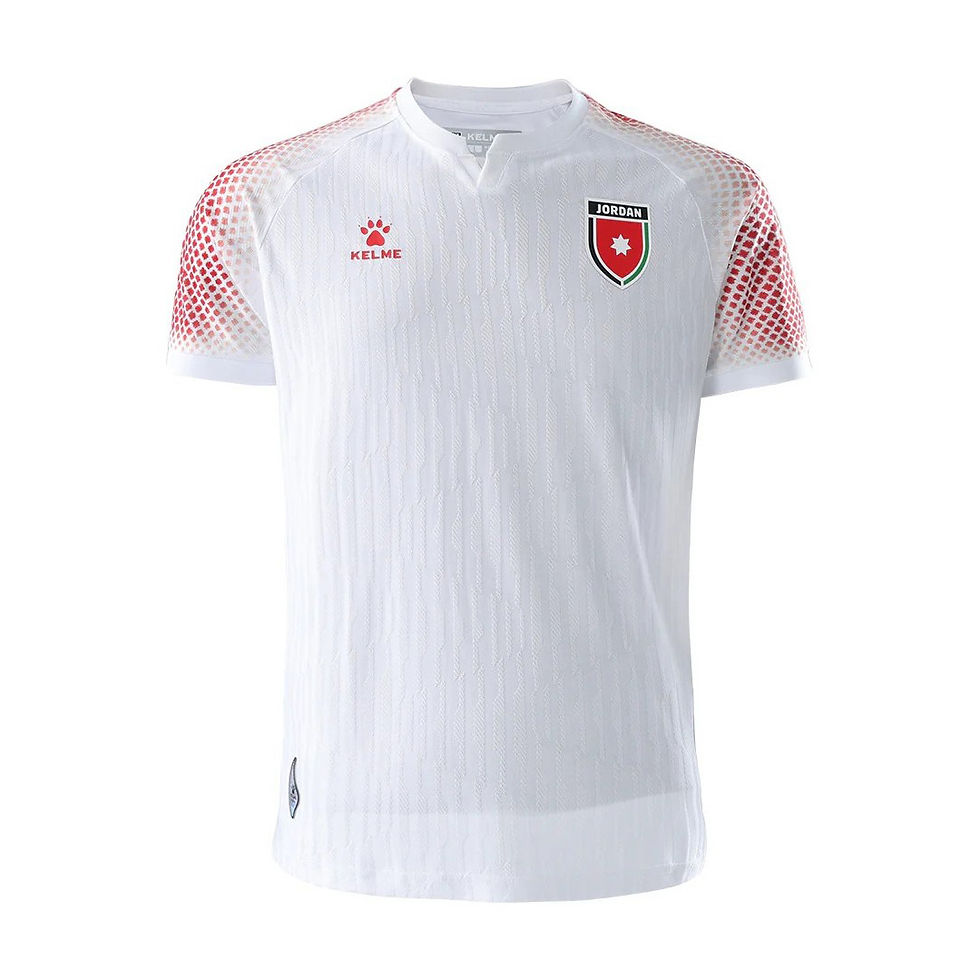


Gabriel: I love the sleeves and these two logos are solid… and that’s about it. Jordan’s black third kit is very sharp and is let down by these average home and away shirts.
36. Uruguay 🇺🇾


Gabriel: In most cases, I would criticize this home shirt for a lack of effort. And even with the black trim, its collar and plain overall design unfortunately give off golf vibes. But Uruguay’s sky blue is such a well-recognized and lovely color template that I don’t mind Nike keeping this one minimal. The away jersey is anything but. In every World Cup kit crop, there is at least one where I can’t decide whether I love it or hate it. I keep going back and forth on Uruguay’s second shirt. Big fan of the crest above the swoosh and the shimmer effect on the logos! Not a fan of the color scheme and the top-heavy pattern!
37. Paraguay 🇵🇾


Ben: The red striped kit is a staple for Paraguay but this execution is too “artistic” for me. And the away looks like a shadowy oil slick.
38. Croatia 🇭🇷


Ben: Similar to how Paraguay was trying to reinvent a classic design, Adidas was trying to do the same with Croatia’s jersey pairing. Some things should stay closer to the original. It really looks like the printer ran out of ink while making these kits.
39. Iran 🇮🇷


Gabriel: The overall design of these shirts is too simplistic to rank them higher on this list, but I’m a huge fan of the Asiatic cheetah image and the cat’s print on the sleeves. Those touches plus the unique manufacturer make these kits feel specific to Iran and earn big creativity points in my book.
40. England 🏴


Ben: You have a solid chance of “bringing it home” and you release two kits that are as boring as the spice level of your food? Come on now.
41. Côte d'Ivoire 🇨🇮
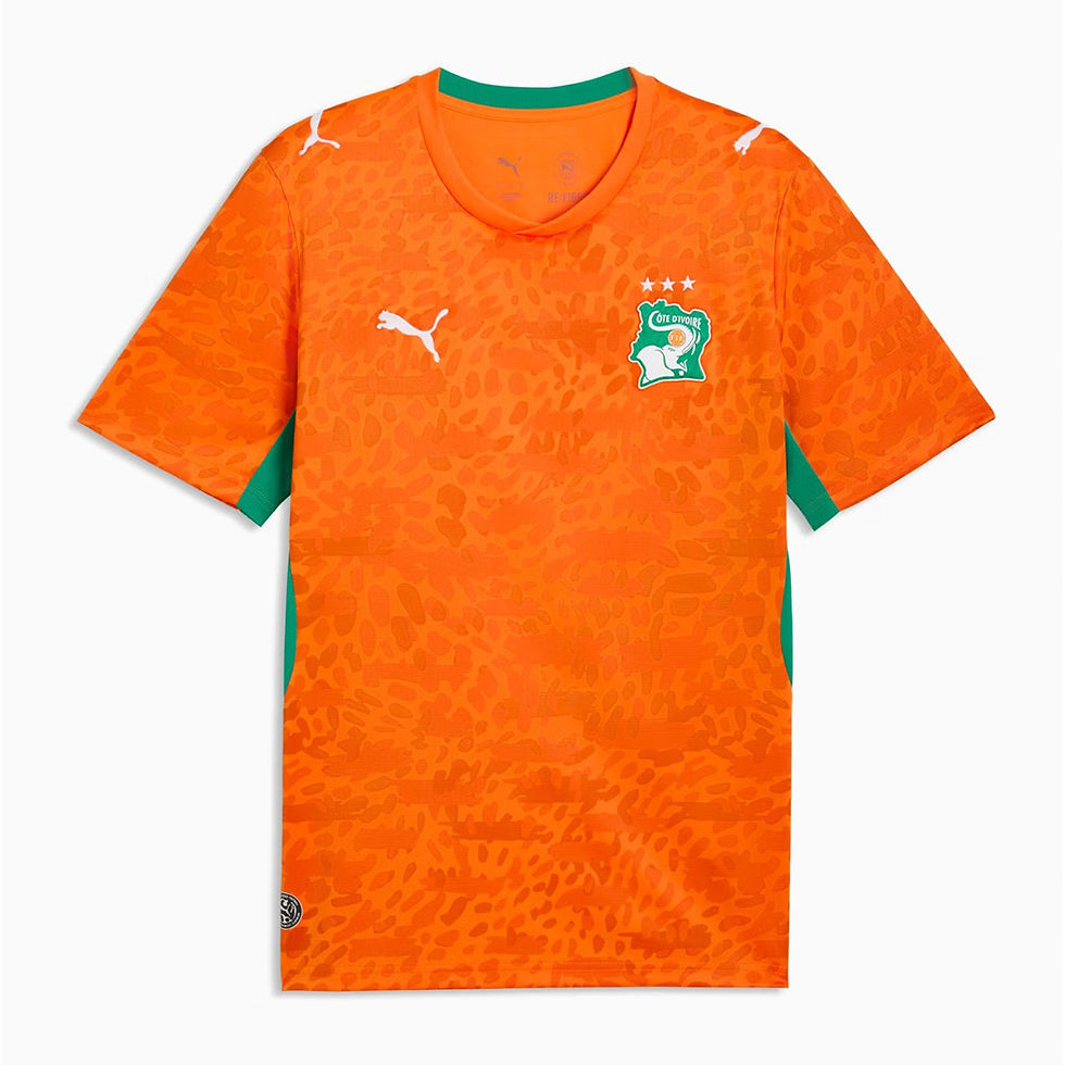

Gabriel: Côte d’Ivoire has another color template that will always lead to some fun home jerseys. The pattern on the orange shirt helps it strike a nice balance between simplicity and originality. The away top is hella creative, and I like all the patterns it features by themselves. But throwing them all on the same canvas while leaving the sleeves blank was not the right move. I put this one in the France/Colombia/Belgium family of ‘away jerseys that I want to like more than I do.’
42. Cape Verde 🇨🇻

Ben: Confusing pattern used in all three kits. I know it’s your debut in the World Cup but take a page of Curaçao’s book please.
43. Haiti 🇭🇹


Gabriel: I love the specific shades of blue and red on these jerseys, the centralized federation logo, and the tribute image of the Battle of Vertières from the successful Haitian Revolution. Otherwise… nope.
44. Ecuador 🇪🇨


Gabriel: They literally just copied their jerseys from the last World Cup and then took away the elements that made those kits cool. Lazy and dumb.
45. Qatar 🇶🇦


Ben: Used all your money to build those fancy stadiums and forgot to pay the design team, huh? Zigzags and a plain white kit make for a pairing that falls flat.
46. Türkiye 🇹🇷

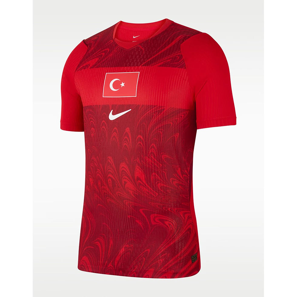
Gabriel: This. Okay, fine, I acknowledge the swirl pattern on the away jersey, and I don’t hate the usage of the flag in place of a team/federation logo. But these are not good.
47. Netherlands 🇳🇱


Ben: Centered iridescent logo? Gross. An orange that is just a bit... too bright? Gross. A white kit with a seemingly random chevroned bar across the chest? Gross. The Dutch aren’t doing much with these two.
48. Uzbekistan 🇺🇿


Gabriel: The pattern on these shirts saves them from being truly woeful, and I like the trim on the collars. But I expected much more from a country making its debut appearance at a World Cup. This team is known as the “White Wolves” and they are coached by a Ballon D’Or-winning legend, and this is the best they could do?? The players and their supporters should’ve gotten a better effort. Booooo!
So, there you have our team rankings. Now, grab a refreshment and stretch those legs before delving into our personal Top 10 jersey lists below!
BONUS: Individual Favorites!
Ben
1. Norway home
2. Spain away
3. Austria away
4. Ghana away
5. New Zealand away
6. South Africa home
7. Germany home
8. Curaçao away
9. Mexico home
10. Australia away
Gabriel
1. Ghana away
My list of personal faves includes three jerseys that I did not write about in our official team rankings, and Ghana’s second strip is the best of that trio. Covered in a fascinating pattern that was designed as a nod to Accra’s famous Makola market, this shirt makes great use of the Ghanaian colors, and the national flag’s black star serves as a visual focal point as well as a reference to the team’s nickname. This is one of those jerseys that wouldn’t feel out of place on a fashion runway thanks to its superb detail and striking creativity. A work of art.
2. South Africa away
I went back and forth for quite some time in deciding which of South Africa’s jerseys I wanted to include in my top ten, and honestly, I could’ve just put both in here. You’re splitting hairs picking one over the other because both are excellent. I love the home golds, but ultimately, the collar, the arrangement of the logos, and the lovely shade of green on the away kits made the difference for me. Bonus points for the white tips on its sleeves. There really are no flaws with this beaut.
3. Mexico 3rd
I only have one "third kit" in my top ten, so third feels like an appropriate place to rank it! You can’t go wrong with any of the Mexican jerseys this year, and on another day, I may have opted for the home green shirts. But as was the case with my previous entry, the color and subtle underlying pattern, the cool and unique logos, and a sharp collar all combine to strong effect on the black third kit. This USMNT fan is wobbling and tempted to cross rivalry lines just to snag one of these…
4. Curaçao away
Adidas really crushed it with the away shirts this year, didn’t they? The smallest nation to ever qualify for a men’s World Cup will be taking the pitch in style thanks to these fashionable tops. My co-writer owns this jersey, and I can attest that it is excellent. The kind of color blending and vibrancy you want to see on your television screens when enjoying the biggest event on the planet.
5. Colombia home
Colombia holds two honors in my book this summer: favorite nickname (‘Los Cafeteros’ - ‘The Coffee Growers’) and favorite home jersey! Speaking of vibrant color templates, look no further than this electric yellow offering that boasts just the right amount of blue and red trim. The shirt also features a subtle butterfly pattern in tribute to legendary writer Gabriel Garcia Marquez. I can’t wait to see Luis Diaz and World Cup legend James Rodriguez do some serious damage to opposition defenses in this top. 10/10.
6. Germany home
Die Mannschaft’s eyebrow-raising away strip will divide opinion, but hopefully we can all agree that their home shirt is quality. Adidas kept it simple, incorporated the country’s flag better than any other jersey at this tournament, and visually balanced all the elements to produce a creative and original kit.
7. France home
I already explained why I love this jersey in our team rankings, and I would be interested to hear the opinions of longtime French football fans to see if this bolder shirt is a welcome change to their team’s usual approach or a swing and a miss. I have no interest in watching this super team reach another World Cup final, but if they manage to do so, at least they’ll be dressed for the occasion.
8. Senegal home
I have so much time for this one. It’s bold, it’s wacky, it’s fun. And most importantly, it’s original. That’s what the World Cup is for! Not every country/team could pull off a shirt like this, but Senegal can.
9. Australia away
It’s not the best kit. It’s not my favorite kit. But it’s cool enough to sneak into my list. I like both of the Socceroos’ submissions for this tournament, but the color creativity of the away strip gives it the edge. It’s pure summer vibes. Why do the Aussies get to have all the fun?
10. United States home
There have been very few World Cups in which a USA jersey would feature in my top ten list. But you know what? Nike finally gave us two solid shirts this year, and we’re hosting the damn thing, so what the hell. I am far from the most patriotic American (especially in this darkest timeline that we’re stuck in). But I assure you that when Chris Richards drives a thumping header into the back of the net in this jersey to send us through to the quarterfinals, the red, white, and blue will come surging back into my body. Loud and proud, baby.
Comments